5 Metrics for Your RFP Win/Loss Analysis Dashboard
October 28, 2025
By
Evie Secilmis

Every proposal tells a story. It has a beginning, a middle, and an end, but most sales teams only pay attention to the final chapter: the win or the loss. By doing so, they miss the entire plot—the crucial details that determined the outcome. An RFP win/loss analysis dashboard is the tool that lets you read the whole story. It goes beyond simple metrics to reveal the narrative behind your numbers. You can see which competitors are your recurring villains, which proposal elements are your heroic strengths, and what plot twists consistently lead to failure. Understanding this story is the first step to writing better ones.
Key Takeaways
- Focus on the 'Why,' Not Just the 'What': A great dashboard moves beyond tracking win rates. It combines performance metrics with direct client feedback to give you a clear understanding of the reasons behind your wins and losses.
- Drive Adoption Through Integration and Customization: To make your dashboard a go-to resource, build it around your team's workflow. Customize views for different roles and integrate the dashboard with your existing tools to make data-driven insights an effortless part of their day.
- Use Data to Continuously Refine Your Process: Treat your dashboard as a dynamic guide for improvement, not a static report. Regularly review trends as a team to identify bottlenecks, test new approaches, and make strategic adjustments that lead to more wins.
What is an RFP Win/Loss Dashboard?
Think of an RFP win/loss dashboard as your team’s command center for proposals. It’s a visual tool that pulls all your proposal data into one place, giving you a clear, at-a-glance view of what’s working and what isn’t. Instead of digging through spreadsheets or relying on gut feelings, a dashboard provides concrete insights into your performance by tracking key metrics related to your wins and losses. It helps you move beyond simply knowing if you won a deal to understanding why.
This tool is designed to help you analyze your proposal strategy and pinpoint the factors that lead to success or failure. Are you losing deals at a specific stage? Are certain types of proposals more successful than others? A dashboard answers these questions with data, not guesswork. By centralizing this information, you can spot trends, share insights with your team, and make smarter, data-driven decisions that refine your entire RFP process. It transforms every proposal—win or lose—into a valuable learning opportunity. This isn't just about tracking numbers; it's about building a strategic advantage. When you can clearly see which competitors you're losing to or which product features are resonating most with clients, you can adjust your approach in real time.
What Makes Up a Great Dashboard?
A great dashboard is more than just a collection of charts; it’s a clear, concise story about your performance. It should focus on the key performance indicators (KPIs) that matter most to your team, like win rates, loss reasons, and submission timelines. The design should be clean and easy to navigate, allowing you to find the information you need without getting overwhelmed. Most importantly, it should provide real-time data to support quick, confident decision-making. Think of it as the difference between a cluttered desk and a well-organized workspace—one creates confusion, while the other empowers you to act.
How to Connect Your Data Sources
To get a complete picture of your RFP performance, your dashboard needs to pull information from all the right places. The real power comes from integrating various data sources to create a single source of truth. This typically means connecting your CRM (like Salesforce or HubSpot), your proposal management software, and any platforms you use for client feedback. By linking these systems, you can track a deal from its initial stages all the way through to the final decision and feedback, ensuring no critical information falls through the cracks. This comprehensive view is what allows for truly meaningful analysis.
Why Your Team Needs One
Implementing a win/loss dashboard is about creating a culture of continuous improvement. It gives your team a systematic way to capture buyer feedback and quickly turn those insights into action. When you can clearly see the patterns behind your wins and losses, you can stop guessing and start building a repeatable strategy for success. A dashboard helps you identify common roadblocks, highlight your team’s strengths, and refine your approach with every proposal you submit. It’s a powerful tool for driving real change and improving your team’s overall effectiveness and win rates.
The Metrics That Matter for RFP Analysis
A great dashboard is more than just a collection of charts; it tells a story about your RFP process. To get the full picture, you need to track a mix of quantitative and qualitative metrics. These five data points will give you a clear view of what’s working, what isn’t, and where you can make the biggest impact. By focusing on these core areas, you can move from simply reacting to RFPs to proactively shaping a winning strategy.
Track Your Win Rate and Pipeline
Your win rate is the most straightforward indicator of your success. It’s the percentage of proposals you submit that result in a win. For instance, if you respond to 100 RFPs and win 44, your win rate is 44%. This metric, also known as your bid-to-win ratio, is your ultimate benchmark. Tracking it over time shows you the health of your entire proposal process. When you see this number change, you know it’s time to dig deeper. A healthy win rate is a sign of a strong pipeline and an effective team, making it the perfect starting point for your RFP analysis.
Measure Response Time and Efficiency
How quickly can your team turn around a high-quality proposal? In the competitive world of RFPs, speed matters. Measuring your average response time helps you understand your team's efficiency and identify bottlenecks in your workflow. If you make a change to your process, like implementing a new tool, your response time is a key metric to watch. A shorter cycle often correlates with a higher win rate because it shows the client you’re responsive and prepared. An AI deal desk can significantly cut down the time it takes to produce a first draft, giving your team more time to focus on strategy and personalization.
Gauge Your Team's Performance
Your dashboard should also offer insights into how your team is performing, both individually and as a whole. You can track metrics like the number of RFPs assigned to each team member and their individual win rates. This isn’t about playing favorites; it’s about identifying who excels at certain types of proposals and who might need more support or training. Looking at team performance helps you balance workloads effectively and build on your collective strengths. It also allows you to see how the team feels about the process, ensuring everyone is engaged and motivated to improve win rates.
Calculate the Financial Impact
Not all RFPs are created equal. Chasing every opportunity can drain your resources without delivering a return. That’s why it’s crucial to calculate the financial impact of your bidding efforts. A good rule of thumb is that the cost to create a bid should be between 0.5% and 2% of the total contract value. By tracking the cost per proposal against the potential revenue, you can make smarter decisions about which RFPs are worth pursuing. This helps your team focus its energy on high-value deals that are more likely to close, maximizing your return on investment.
Gather Client Feedback
Numbers tell you what happened, but client feedback tells you why. A comprehensive win/loss analysis must include qualitative data directly from the source. For wins, what did the client love about your proposal? For losses, where did you fall short? Building a systematic way to capture this feedback is essential. You can include key quotes or summary notes in your dashboard to give context to your win/loss data. These insights are invaluable for refining your approach, understanding your competitors, and building stronger proposals for the future. This feedback loop turns every RFP into a learning opportunity.
How to Build a Powerful RFP Dashboard
Building a dashboard from scratch might sound intimidating, but it’s really about making smart, simple choices. Think of it as creating a custom command center for your RFP process. The goal is to give your team a clear, at-a-glance view of what’s working and what isn’t. By focusing on the right metrics and presenting them in an easy-to-understand way, you can turn raw data into your team’s most valuable asset. Let’s walk through the four key steps to creating a dashboard that drives real results.
Set Your Key Performance Indicators (KPIs)
Before you can build anything, you need to know what you want to measure. This is where Key Performance Indicators (KPIs) come in. Don’t just track every metric you can find; choose the numbers that truly reflect your business goals. Start by asking what success looks like for your RFP process. Is it a higher win rate? A faster response time? More revenue from won deals?
Once you have your answer, select three to five core KPIs that align with those objectives. Common choices include win/loss rate, proposal submission volume, average response time, and revenue generated from RFPs. By focusing on a few critical metrics, you can create a dashboard that provides clear direction instead of overwhelming your team with data. This focused approach ensures everyone is working toward the same strategic goals.
Visualize Your Data Effectively
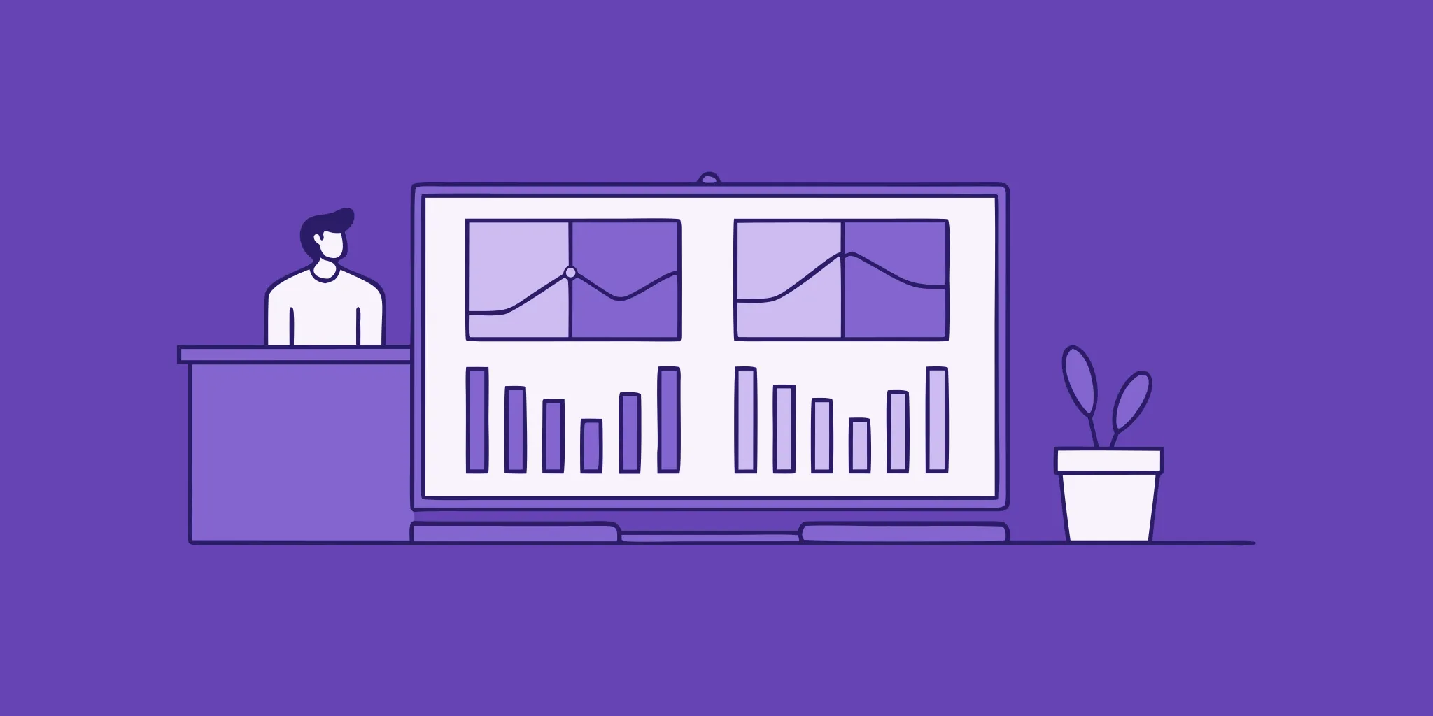
How you display your data is just as important as the data itself. A great dashboard uses charts and graphs to turn complex numbers into simple, visual stories. This helps your team quickly see how you’re performing against your goals without having to sift through spreadsheets. For example, a line chart is perfect for tracking your win rate over time, while a bar chart can compare the performance of different team members or proposal types.
The key is to choose the right visualization for each KPI. Use pie charts to show the breakdown of wins versus losses, and consider gauges or simple number callouts for your most important metrics, like your overall win rate. A well-designed dashboard should be intuitive, allowing anyone to understand performance at a glance and spot trends as they emerge.
Customize Your Dashboard View
Not everyone on your team needs to see the same information. A sales leader will be interested in high-level trends and team performance, while an individual proposal writer might want to focus on their personal pipeline and efficiency metrics. That’s why it’s so important to customize the dashboard view for its audience. A one-size-fits-all approach rarely works because it either provides too much irrelevant information or not enough of the right details.
Consider creating different versions or views of your dashboard for different roles. The executive view might highlight overall win rates and financial impact, while the team view could focus on operational metrics like response times and workload distribution. Tailoring the dashboard ensures that the information is relevant and actionable for each user, which encourages adoption and helps everyone make better, data-driven decisions in their roles.
Follow These Implementation Steps
With your KPIs, visualizations, and audience in mind, it’s time to bring your dashboard to life. A structured implementation plan will keep the process organized and on track. Start by creating a schedule with clear tasks and assigning them to specific team members. This ensures everyone knows their responsibilities, from connecting data sources to designing the final layout.
Next, build your dashboard using a tool that integrates with your existing systems, like your CRM and RFP software. Once a prototype is ready, have your team test it and provide feedback. This step is crucial for ironing out any issues before the official rollout. A well-planned implementation will help you build your win-loss program the right way, turning valuable insights into a true competitive advantage for your team.
How to Spot Win/Loss Patterns
A good dashboard doesn't just show you data; it tells you a story. Once you have your metrics in place, the next step is to look for the patterns that reveal the plot twists in your sales cycle. This is where you move from simply tracking wins and losses to truly understanding the why behind them. By identifying recurring themes in your successes and setbacks, you can make strategic adjustments that have a real impact on your bottom line. It’s about connecting the dots between your team’s actions and the final outcome.
Analyze Your Winning Formula
What do all your successful proposals have in common? This is the core question to answer. Start by looking at your win rate. It might surprise you to learn that the average company wins 44% of the proposals they submit, so if you’re in that ballpark, you’re on the right track. But the real insights come from digging deeper. Look for common threads in your wins. Was it a particular pricing structure? A specific team member leading the response? Maybe you have a higher success rate in a certain industry or with companies of a specific size. Identifying this "winning formula" helps you replicate your successes and focus your efforts where they’ll be most effective.
Identify Common Reasons for Losses
Losing a deal is never fun, but it’s one of the most valuable learning opportunities you have. The goal here isn’t to point fingers but to find correctable patterns. Sometimes, the biggest hurdle is getting everyone to look at the results objectively, as internal opposition can prevent teams from learning from mistakes. Look at your losses collectively. Are you consistently being outbid on price? Are you losing to the same competitor over and over? Perhaps feedback indicates your responses lack detail in a specific area. Finding these common reasons for losses allows you to address the root cause, whether it’s through retraining your team, adjusting your pricing strategy, or refining your proposal content.
Spot Important Trends
Beyond individual wins and losses, your dashboard can reveal broader trends over time. A single loss to a new competitor might be a fluke, but three losses in a quarter is a trend. The most effective teams build systematic programs that capture buyer feedback and quickly turn those insights into action. Pay attention to how your metrics change over months or quarters. Is your response time getting slower as your team gets busier? Are you seeing more RFPs from a new industry? Spotting these trends early allows you to adapt your strategy proactively instead of reacting after the fact. It’s about seeing the forest, not just the individual trees.
Keep an Eye on the Competition
Your RFP process doesn’t happen in a vacuum. Understanding why you win or lose provides critical insights into your competitive positioning. Your dashboard should help you track who you’re up against in these deals. Who do you beat most often? Who consistently wins against you? This isn’t about obsessing over every move your competitors make. Instead, it’s about understanding their perceived strengths and weaknesses from the client’s perspective. If you repeatedly lose to Competitor X on price but beat Competitor Y on feature depth, that tells you exactly how to position your solution depending on who else is in the running.
How to Overcome Common Challenges
Building a powerful RFP dashboard is an incredible step forward, but it’s not always a straight path. Like any new initiative, you might run into a few bumps along the way. The most common hurdles aren’t about the technology itself, but about the data, people, and processes that support it. Think of it this way: a fancy car is useless without clean fuel and a driver who knows where they’re going.
The good news is that these challenges are completely manageable with a bit of planning. By focusing on data quality, getting your team excited, connecting your tools, and treating your dashboard as a living project, you can ensure it becomes an indispensable part of your sales process. Let’s walk through how to tackle each of these potential roadblocks so you can get the most value from your win/loss analysis from day one.
Ensure High-Quality Data
Your dashboard is only as insightful as the data that powers it. If your data is messy, incomplete, or inconsistent, you’ll get a skewed picture of your performance, which can lead to poor decision-making. Garbage in, garbage out, as they say. Ensuring you have a high-quality data foundation is crucial because it builds trust in the insights you uncover.
To keep your data clean, start by standardizing how your team enters information into your CRM and other systems. Create simple, clear guidelines for everyone to follow. It’s also a great idea to schedule regular data audits—maybe once a quarter—to find and fix any inconsistencies. This proactive approach ensures your win/loss analysis is always based on accurate, reliable information.
Get Your Team on Board
A dashboard full of brilliant insights is useless if no one on your team uses it. Getting buy-in from the start is essential for making the dashboard a central part of your sales culture. If your team sees it as just another top-down mandate, they’re less likely to engage with it. Instead, you need to foster a culture of continuous improvement where everyone feels invested in the process.
Involve your sales reps in the creation process. Ask them what metrics they believe are most important for winning deals and what information would help them do their jobs better. When they see their own feedback reflected in the final product, they’ll feel a sense of ownership. Follow up with clear training that shows them exactly how the dashboard can help them close more deals and hit their targets.
Integrate with Your Existing Tools
Your team is already juggling multiple platforms, from your CRM to your communication apps. The last thing you want is for your new dashboard to feel like another disconnected island of data. Manually exporting and importing information is a recipe for errors and wasted time. To make your dashboard truly effective, it needs to integrate seamlessly with the tools your team already uses every day.
Connecting your dashboard to your CRM, for example, allows for the automatic flow of deal information. Better yet, integrating it with your proposal software can provide a direct line to your RFP performance data. An AI deal desk solution can feed response times, content usage, and submission data directly into your analysis tools, giving you a complete and automated view of your RFP process without any extra manual work.
Monitor Your Dashboard's Performance
Your business isn’t static, and your dashboard shouldn’t be either. The KPIs that are critical today might be less relevant six months from now as your goals shift and your market evolves. A "set it and forget it" approach will quickly lead to a dashboard that feels stale and out of touch. Think of your dashboard as a living tool that needs to adapt along with your strategy.
Schedule regular check-ins—once a quarter is a good cadence—to review the dashboard’s effectiveness. During these reviews, ask your team for feedback. Are the visualizations still clear? Are the metrics helping them make better decisions? Be open to tweaking, adding, or even removing certain elements to ensure your dashboard remains a sharp, relevant, and valuable asset for your entire team.
Take Your Dashboard to the Next Level
Once your RFP win/loss dashboard is up and running, you’ve built a solid foundation. But a great dashboard isn’t a static report; it’s a dynamic tool that evolves with your business. To get the most out of your analysis, you can incorporate more advanced strategies that turn your data from a simple scorecard into a strategic powerhouse. By integrating AI, automating your reporting, fostering real-time collaboration, and using your data to predict future trends, you can create a truly indispensable asset for your sales team. These next steps will help you uncover deeper insights and make more proactive, data-driven decisions.
Use AI for Deeper Insights
Your metrics tell you what happened, but AI can help you understand why. While standard dashboards track quantitative data, AI-powered tools can sift through thousands of pages of qualitative data from your past RFPs and client feedback to find hidden patterns. For example, an AI tool can identify which pieces of your proposal content are most frequently associated with wins or which answers need updating. This allows you to move beyond simple win rates and get specific, actionable feedback on your content's performance. A truly successful win-loss program uses these kinds of detailed insights to make measurable improvements to the proposal process.
Set Up Automated Reports
Manually pulling data and building reports every week or month is time-consuming and leaves room for human error. Setting up automated reports frees your team from tedious administrative work so they can focus on what they do best: selling. You can schedule regular email summaries of key KPIs to be sent to stakeholders, or create alerts for significant changes in your win rate or response times. When insights are delivered directly to your team consistently, they become a natural part of the workflow. This transforms your win-loss analysis from a reactive exercise into a proactive tool that gives you a competitive advantage.
Collaborate in Real Time
A dashboard is only valuable if your team actually uses it. To avoid it becoming another ignored bookmark, make it a collaborative hub. The best dashboard tools integrate with the communication platforms your team already uses, like Slack or Microsoft Teams, allowing for discussions right alongside the data. When a team member spots an interesting trend, they can tag a colleague and start a conversation instantly. This breaks down information silos and prevents the internal opposition that can sometimes arise when sharing performance results. By making data accessible and discussable, you foster a culture of transparency and continuous improvement.
Predict Future Outcomes
The ultimate goal of analyzing past performance is to improve future results. Advanced dashboards can use your historical data to power predictive analytics, helping you forecast future outcomes with greater accuracy. By analyzing the characteristics of past deals, these tools can predict the likelihood of winning a new RFP based on factors like the industry, deal size, or specific client requirements. This allows you to identify potential deal failure patterns early on and prioritize opportunities where you have the highest chance of success, ensuring your team focuses its energy on the deals that matter most.
Find the Right RFP Dashboard Tool
A dashboard is only as good as the actions it inspires. Once you’ve identified the metrics that matter most to your team, the next step is finding a tool that can track them effectively and present them in a way that’s easy to understand. The goal is to turn a potentially confusing process into one that is clear, trackable, and efficient. You want a central hub where your team can see progress, spot patterns, and make data-backed decisions without having to dig through spreadsheets or piece together information from different sources. This isn't just about convenience; it's about creating a single source of truth that aligns everyone, from proposal managers to sales leaders.
Choosing the right software is about more than just pretty charts; it’s about finding a partner that helps you streamline your entire response process. The right platform will not only display your win/loss data but also provide the analytics and insights you need to understand the story behind the numbers. This is how you move from simply reacting to outcomes to proactively shaping them. A powerful dashboard gives you the ability to drill down into specific deals, compare performance across different team members or regions, and see how your response quality impacts your win rate over time. It transforms your RFP data from a historical record into a strategic asset for future growth.
How HeyIris.ai Can Help
An RFP response management dashboard should give your team the clarity it’s been missing. With Iris, you get a centralized view of your entire RFP pipeline, from initial request to final decision. Our AI-powered platform doesn't just track your win rates and response times; it helps you understand why you’re winning or losing. By analyzing your content and performance, Iris provides the insights you need to refine your strategy. It turns raw data into a clear roadmap, showing you exactly where to focus your efforts for the biggest impact. This means less time guessing and more time making informed decisions that improve your win rate.
What to Look for in Other Tools
When you’re evaluating different dashboard tools, focus on a few key features. First, look for a solution that offers seamless integration with your existing systems, especially your CRM. The ability to automatically pull data from tools like Salesforce saves countless hours and reduces the risk of manual error. You should also look for customizable reporting that allows you to track the specific RFP metrics that are most important to your business. A great tool will be intuitive for your whole team to use, encouraging adoption and making data analysis a regular part of your workflow, not a chore.
Choose the Best Solution for You
Ultimately, the best tool is the one that fits your team’s unique process and goals. Look for a solution that helps you build a systematic program for win-loss analysis. This means it should do more than just store data; it should help you capture buyer feedback, quickly turn insights into action, and drive real change across your organization. As you explore your options, consider how each platform will empower your team to not only respond to RFPs more efficiently but also more intelligently. Seeing how other companies have succeeded can be a great guide; check out case studies to see how teams like yours have transformed their RFP process.
Get the Most Out of Your Dashboard
Building a dashboard is the first step, but using it effectively is what truly makes a difference. A great dashboard isn't just a set of charts; it's a dynamic tool that guides your strategy and helps your team make smarter decisions. To get there, you need a solid foundation of clean data, a well-trained team, and a commitment to refining your process. Think of your dashboard as a living part of your sales strategy—one that requires regular attention to deliver the best results. By focusing on these key areas, you can transform your win/loss analysis from a simple report into a powerful engine for growth.
Follow Data Collection Best Practices
Your dashboard is only as reliable as the data you feed it. Inconsistent or incomplete information will give you a skewed picture of your performance, leading to flawed conclusions. Start by standardizing how your team logs information for every RFP. This includes everything from submission dates and client industries to the final win/loss reason. A clear process ensures everyone is on the same page and that the data is clean. Your win rate is a direct reflection of how well your proposal process is working, so tracking it with accurate data helps you spot which opportunities are worth pursuing and where you can improve.
Train Your Team for Success
A powerful dashboard is useless if your team doesn’t know how to read it or what to do with the information. Schedule regular training sessions to walk everyone through the key metrics and what they signify. Go beyond the "what" and focus on the "so what." For example, if the dashboard shows you're losing bids in a specific industry, what's the next step? A successful win-loss program requires your team to be selective and turn insights into measurable actions. Empower them to ask questions, dig into the data, and use the dashboard to inform their daily decisions and long-term strategies.
Optimize Your RFP Process
The ultimate goal of your win/loss dashboard is to help you refine your RFP process. Use the insights you gather to make concrete improvements. For instance, if you notice your response time is lagging on complex proposals, you might need to reallocate resources or adopt better tools. Using RFP software can make data compilation much easier, leading to better decisions. The dashboard should highlight bottlenecks and weaknesses, giving you a clear roadmap for what to fix. Treat every loss as a learning opportunity and every win as a formula to replicate.
Commit to Continuous Improvement
Your market, competitors, and customers are always changing, which means your RFP strategy can't afford to stand still. Win/loss analysis isn't a one-and-done project; it's an ongoing cycle of review and adaptation. Revisit your dashboard regularly—weekly or bi-weekly—to discuss trends and findings as a team. This commitment to continuous improvement is what turns insights into a real competitive advantage. As your business grows, your dashboard and your win-loss analysis should evolve with it, ensuring you're always focused on the metrics that matter most.
Related Articles
- Top 10 RFP Software Solutions to Close Deals Faster
- Maximizing Your RFP Win Rate Strategies
- 8 Best RFP Response Automation Software Platforms
Frequently Asked Questions
We're a small team. Is building a dashboard like this really worth the effort? Absolutely. In fact, for a small team, it’s even more critical. A dashboard helps you focus your limited resources on the opportunities you’re most likely to win. Instead of chasing every RFP, you can quickly see which types of deals have the best return. It turns every proposal, win or lose, into a valuable lesson, helping your team refine its approach and improve its win rate without needing more people or hours in the day.
I'm not sure where to start. What's the single most important metric to track first? If you're just starting out, focus on your win rate. It’s the clearest and most direct measure of your success. Simply tracking the percentage of proposals you win gives you a baseline to measure everything else against. Once you have a handle on that number, you can begin to explore other metrics, like response time or loss reasons, to understand what factors are driving your win rate up or down.
My team is resistant to new processes. How can I get them to actually use this dashboard? The best way to get buy-in is to make them part of the creation process. Ask your team what information they feel would help them win more deals and build the dashboard to answer those questions. Frame it as a tool to help them succeed and highlight their strengths, not as a way to micromanage their performance. When they see how it can make their work easier and more effective, they'll be much more likely to embrace it.
Our data is a mess. Can we still build a useful dashboard? Yes, you don't need a perfect historical record to get started. The most important step is to create a simple, standardized process for collecting data from this point forward. Begin by tracking just one or two key metrics consistently for all new RFPs. You can build a powerful dashboard with the data you collect from today onward, and it will only become more insightful over time.
How is an AI-powered dashboard different from a standard one I could build in a spreadsheet? A standard spreadsheet dashboard can tell you what happened—for example, that you lost a deal. An AI-powered dashboard can help you understand why. It goes beyond tracking numbers by analyzing the actual content of your proposals to find hidden patterns. It can identify which answers are most effective or flag outdated information, giving you much deeper, more actionable insights to improve your strategy.
Share this post
Link copied!